Types of Map Projections Explained: Families, Equal Earth, and Real Distortion
The three projection families, why cartographers dispute them, what the UN's Equal Earth vote actually says, and distortion measured on a live game map.
On this page
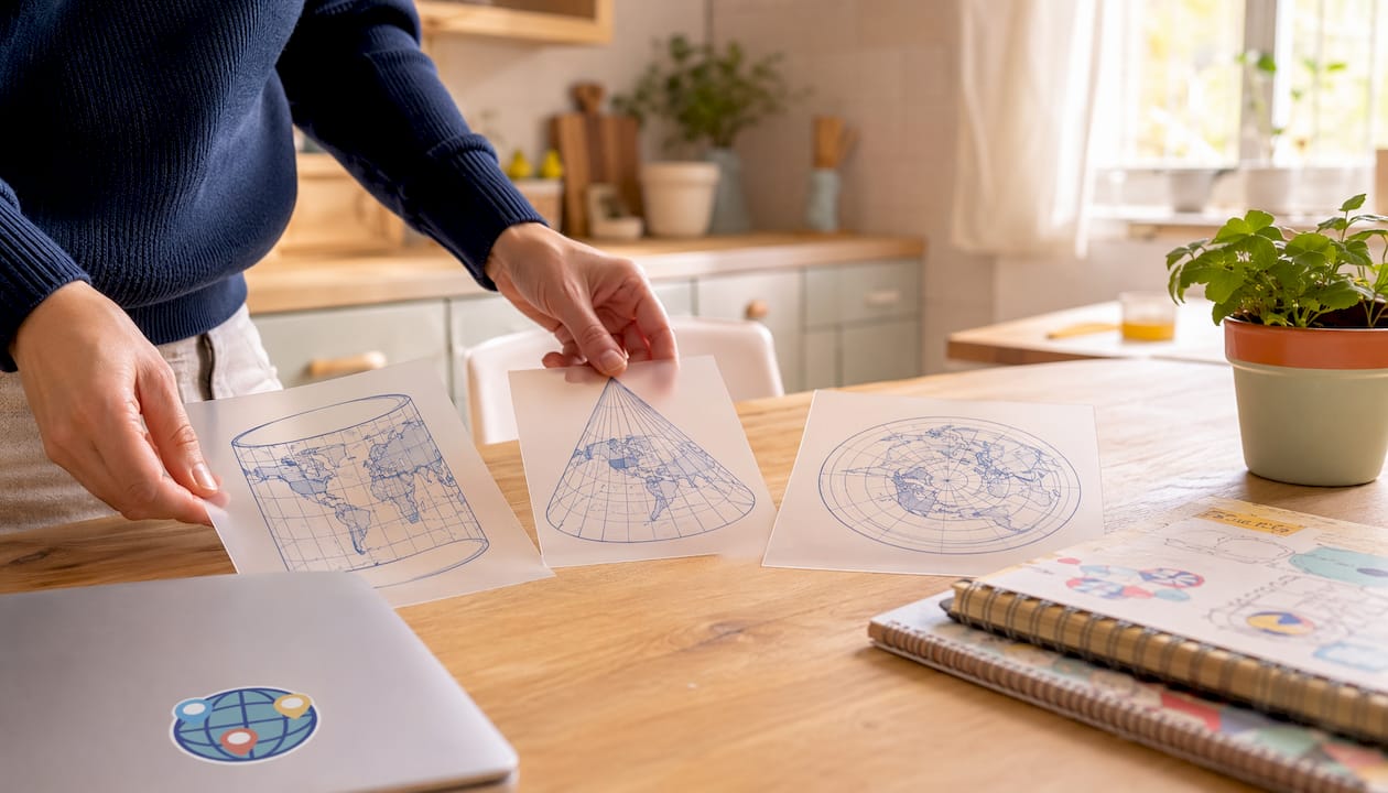
Almost every world map you see belongs to one of three families: cylindrical, conic, or azimuthal. This short answer seems to be too simplistic, isn’t it? You are not alone. It is also the answer professional cartographers spend papers arguing against, and two of the most talked about world maps of the last decade do not fit it at all.
This guide covers the map-families, the objections to them, the actual decision made by the UN about Mercator in September 2026, and what projection distortion looks like when you measure it on a working map instead of describing it.
TL;DR
- Cylindrical wraps the globe like a tube. Straight grid, poles smeared into lines.
- Conic sits over the mid-latitudes like a hat. Meridians fan out, parallels curve.
- Azimuthal touches at one point. Meridians radiate, parallels are circles.
- Pseudocylindrical belongs to none of them, and that is where the interesting maps live.
The three surfaces you can unroll
A developable surface is any shape you can flatten into a sheet without tearing it. The classic teaching model asks you to imagine wrapping one of three such shapes around a globe, casting the Earth’s grid onto it, then unrolling it.
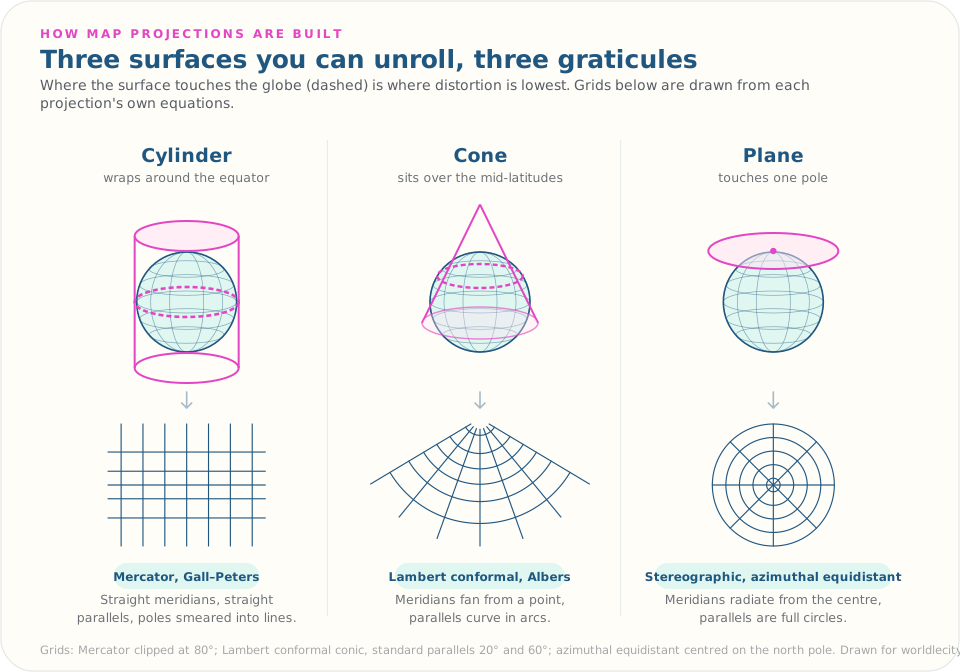
- Cylinder wraps around the equator. Unrolled, you get a rectangle with straight, parallel grid lines.
- Cone caps the mid-latitudes. Unrolled, meridians fan from a point and parallels curve in arcs.
- Plane touches one pole. Meridians radiate from the centre like spokes, parallels form rings.
Picture a paper towel tube, a traffic cone, and a dinner plate pressed against the North Pole. Each touches the globe differently, so each distorts differently.
Where the surface touches is where the map is most accurate. A tangent case touches along a single line; a secant case slices through and meets the globe along two. Contact lines matter because they mark the locations of zero distortion, which is why secant projections with two standard parallels are the standard choice for regional mapping across a wide band of latitude.
Why cartographers say this is the wrong way to sort projections
Here is the part most guides leave out. The three-family scheme is a teaching aid, not a real taxonomy, and specialists have been saying so for years.
In Map Projections Classification, cartographers Miljenko Lapaine and Nedjeljko Frančula review how textbooks sort projections by developable surface and conclude that such a classification is unacceptable, calling instead for a definition grounded in the mathematics rather than in the imagined cone or cylinder.
The objection is easy to see once it is pointed out:
- There is no actual surface. A projection is a pair of equations mapping latitude and longitude to x and y. Mercator in particular is not produced by geometrically casting the globe onto a cylinder from a light source at the centre. Its spacing comes from a logarithmic formula chosen to keep angles true.
- Many projections fit no surface at all. Robinson, Winkel Tripel and Equal Earth have curved meridians and straight parallels. No cylinder, cone or plane produces that. They get filed under “pseudocylindrical,” which is really a way of saying the scheme ran out of room.
- The surface does not tell you what matters. Knowing a map is cylindrical tells you nothing about whether it preserves area or angle. Mercator and Gall-Peters are both cylindrical and they are opposites.
So keep the three families, because they genuinely help you read a grid at a glance. Just do not mistake them for how the field classifies its own work. What a projection preserves is the question that decides whether it is fit for a job.
The projections you actually meet
There are hundreds of named projections. For reading maps and playing geography games, a handful covers almost everything. Each keeps something and pays for it somewhere else.
| Projection | Family | Keeps | Pays with |
|---|---|---|---|
| Mercator | Cylindrical | Angles and local shape | Area, savagely, toward the poles |
| Gall-Peters | Cylindrical | Area | Shape, stretched vertically in the tropics |
| Robinson | Pseudocylindrical | Nothing exactly; a compromise | A little of everything |
| Winkel Tripel | Pseudocylindrical | Low overall distortion | No property held exactly |
| Equal Earth | Pseudocylindrical | Area | Shape, mildly |
| Lambert conformal conic | Conic | Shape along two parallels | Accuracy far from them |
| Albers equal-area conic | Conic | Area across mid-latitudes | Shape |
| Stereographic | Azimuthal | Angles everywhere | Scale grows away from centre |
| Azimuthal equidistant | Azimuthal | Distance from the centre point | Everything measured between other points |
A few details worth carrying:
- Mercator was built for sailors. A straight line drawn on it is a constant compass bearing, which is exactly what you need to steer a ship. It inflates area to do that.
- Robinson served as National Geographic’s primary world map from 1988 until 1998, when Winkel Tripel replaced it.
- Azimuthal equidistant is the projection on the United Nations emblem, centred on the North Pole. Distances measured outward from that centre are true to scale; distances between two other points on the map are not.
- Equal Earth is the newcomer, and the reason this article needed rewriting.
What the UN voted for in September 2026
On 4 September 2026 the UN General Assembly adopted a resolution called Correct the Map, sponsored by the African group and led by Togo. It passed 164 votes to 1, with 6 abstentions; the United States cast the only vote against.
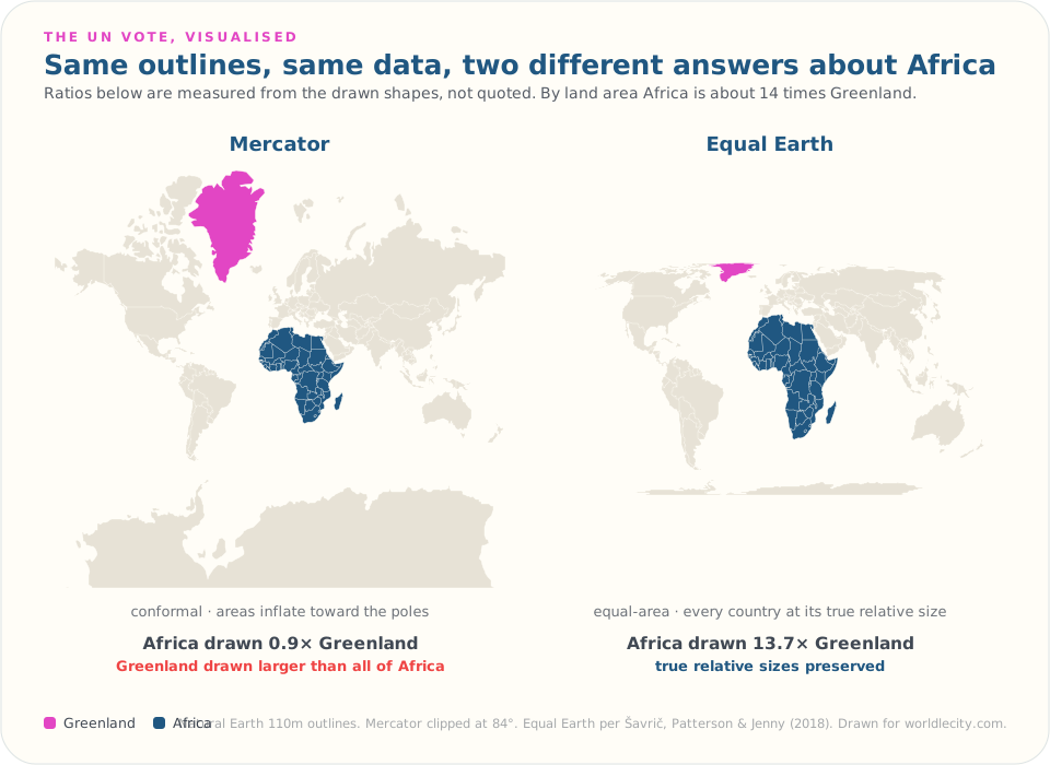
The figure above is drawn from a single set of country outlines, projected two ways by the same code. The ratios under each map are measured from the shapes as drawn, not quoted from a source. On Mercator, Africa comes out at 0.9 times the drawn area of Greenland, meaning Greenland is rendered slightly larger than an entire continent. On Equal Earth, Africa comes out at 13.7 times Greenland, which is what these outlines genuinely measure on a globe. By land area the real figure is about 14 times; the small gap is the simplified coastlines, not the projection.
Be precise about what the resolution does, because a lot of coverage was not. It does not ban Mercator. It does not mandate a replacement. It encourages governments, schools, international organisations and technology companies to use equal-area projections where relative size matters, names Equal Earth as one that represents relative size accurately, and acknowledges Mercator’s usefulness for navigation. It is guidance, not law. The UN’s own emblem, incidentally, is unaffected: that is azimuthal equidistant, and it is not an equal-area map either.
Equal Earth itself dates to 2018, created by Bojan Šavrič, Tom Patterson and Bernhard Jenny and published in the International Journal of Geographical Information Science. It is a pseudocylindrical equal-area projection built by blending the Putniņš P4’ and Eckert IV projections, shaped deliberately to resemble the Robinson map people already find familiar while holding areas true.
Its creators are notably unwilling to oversell it. Writing about the wave of institutional adoptions, they cautioned that equal-area projections are “not the panacea that these organisations might think,” adding that “continental shapes suffer.” That is the honest position, and it is the whole lesson of this article stated by the people with the most to gain from overstating their own work.
What distortion actually means
No flat map can hold area, shape, distance and direction true at once. This is not a design failure anyone could engineer away. Gauss’s Theorema Egregium established that a curved surface cannot be flattened without stretching it, which is why, as Esri puts it, “it is impossible to represent a curved surface (the earth) on a flat one (a map) without stretching, skewing, and tearing it”. Every projection picks which compromise to accept.
- Area distortion: countries look bigger or smaller than they are.
- Shape distortion: coastlines and borders look stretched or squashed.
- Distance distortion: the gap between two places on the map does not match the real gap.
- Direction distortion: a straight line between two points does not follow the true bearing.
Mercator makes area distortion concrete. Africa covers roughly 30.4 million square kilometres, Greenland about 2.2 million. Mercator draws them at similar sizes because its scale factor grows with latitude, inflating everything near the poles.
That same inflation applies to distances, and it runs the opposite way to most people’s intuition: on Mercator, high-latitude distances are drawn too long relative to equatorial ones, not too short. Two cities in northern Scandinavia occupy far more of the map than two cities the same distance apart on the equator.
What a projection choice costs, measured on a live game
Reading about distortion is one thing. Here is what it does inside software that people use every day, measured rather than asserted.
WorldleCity’s daily city game tells you, after each wrong guess, how far your guess was from the mystery city and which way to head. To produce those two numbers it treats the world as a flat rectangle: it computes distance on an equirectangular model, and it computes the arrow as the angle on that flat map, with longitude scaled for latitude so the arrow follows a Mercator heading. That is a projection decision, made in code, with consequences you can watch.
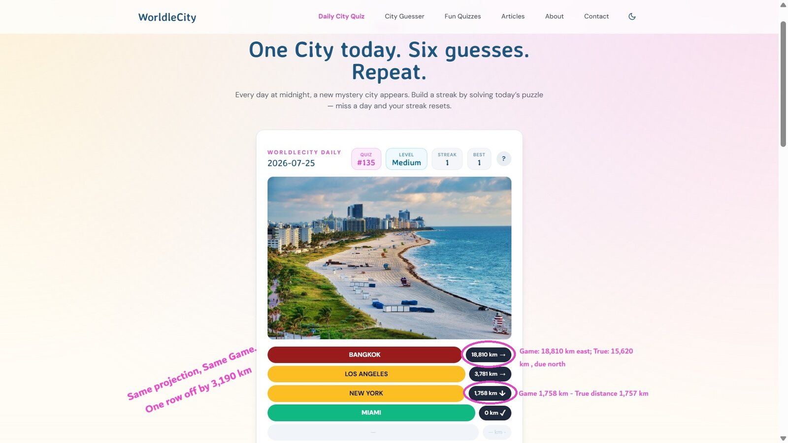
Look at the three wrong guesses on that board, with the answer being Miami:
| Guess | Game shows | True great-circle | Game’s arrow | True bearing |
|---|---|---|---|---|
| New York | 1,758 km | 1,757 km | S | S (201°) |
| Los Angeles | 3,781 km | 3,758 km | E | E (94°) |
| Bangkok | 18,810 km | 15,620 km | E | N (1°) |
The New York guess is accurate to a single kilometre and one degree. The Los Angeles guess is within 0.6%. The Bangkok guess is 3,190 km too long, and its arrow points east when the shortest route to Miami runs almost due north, over the Arctic (the crow flies route).
Nothing is broken. On a flat rectangle, Bangkok really does sit far to the east of Miami. It is only over the pole that the rectangle stops being a fair model of a sphere, and a rectangle has no way to express “the short way is across the top.”
Measured across every guess a player can make paired with every city the game can pick, the pattern is consistent:
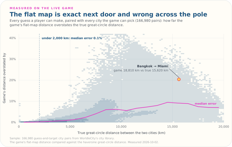
- Below 2,000 km the median error is about 0.1%, which is to say invisible.
- Across all pairs the median is 2.7%, and the worst pairs run past 40%.
- The flat map always overstates, never understates, because flattening stretches.
- The direction arrow lands in a different one of the eight compass sectors than the true bearing on 45% of pairs, with a median gap of about 15 degrees.
That last number sounds alarming until you notice where it lands. Wild arrow disagreement happens on long, near-antipodal guesses, exactly the guesses you make first and then abandon. Once you are within a couple of thousand kilometres, which is where the game is actually decided, the distance is effectively exact and the arrow is typically within about 2 degrees of the true heading. The projection was chosen to be right where it matters and to fail gracefully where it does not, which is what choosing a projection means.
There is a pleasing tension in the same product: the guess trail is drawn on an orthographic globe, an azimuthal projection, while the numbers beside it come from a flat rectangle. One screen, two models of the Earth, disagreeing politely.
Practising across projections is also the fastest way to stop trusting a single mental picture of where things are, which is half of answering geography questions faster.
How to spot a projection type at a glance
You do not need the equations. A few visual rules cover most maps:
- Straight vertical meridians meeting horizontal parallels at right angles points to cylindrical (Mercator, Gall-Peters).
- Meridians fanning from a point above the map, parallels curving in arcs points to conic (Lambert, Albers).
- Meridians radiating from a centre, parallels as full circles points to azimuthal.
- Curved meridians with straight, horizontal parallels points to pseudocylindrical (Robinson, Winkel Tripel, Equal Earth, Mollweide).
- Poles drawn as lines rather than points points to cylindrical or pseudocylindrical.
- A circular map is azimuthal, with no exceptions worth worrying about.
- Antarctica as a thick band across the bottom is Mercator or a close cylindrical relative.
Under time pressure, check the poles first. How Antarctica and the Arctic are drawn tells you more about the family than any other single feature.
Cheat sheet: which projection fits which quiz scenario
| Scenario | Best family | Why |
|---|---|---|
| World city guessing, all latitudes | Compromise (Robinson, Winkel Tripel) | Balanced distortion, no region wildly misleading |
| Size-comparison rounds | Equal-area (Equal Earth, Albers) | True relative sizes remove the guessing bias |
| Mid-latitude regional rounds | Conic (Lambert, Albers) | Low distortion along the standard parallels |
| Polar rounds | Azimuthal | Directions from the centre are accurate |
| Navigation and route puzzles | Mercator | Straight lines hold a compass bearing |
| Short-range distance feedback | Equirectangular | Effectively exact under a couple of thousand kilometres, and cheap to compute |
Practice exercises
- The same city, twice. Find a high-latitude city such as Oslo or Anchorage on a Mercator map, then on an equal-area map. The shift in its apparent size is your calibration error on every Mercator-based quiz.
- Guess the family. Open any world map and name its family in under five seconds using the poles rule above. Do this until it is automatic.
- Long guess, short answer. In the daily city game, make a deliberately antipodal first guess and note how the arrow behaves; then work inward and watch it sharpen. You are feeling the difference between a flat model and a round world.
- Climb the difficulty modes. The four city guesser modes strip away obvious landmarks as you go up, so the distance and direction reads carry more of the weight and the projection’s behaviour starts to matter to your score.
Common myths, busted
“Mercator is just wrong.” Mercator is conformal on purpose, so that a compass bearing drawn straight stays true. It is the wrong tool for comparing sizes, not a broken map. Togo’s foreign minister, presenting the UN resolution, drew the same distinction: the effort was not meant to condemn Mercator, whose usefulness for navigation he acknowledged.
“Equal-area maps are always better.” Equal-area maps distort shape to hold size. The Equal Earth authors said it themselves: equal-area projections are “not the panacea that these organisations might think,” because “continental shapes suffer.” Accurate at what is the question that matters.
“All maps lie equally.” They do not. A secant conic over a single country can be near-exact along its standard parallels, while a Mercator world map is wildly off above 60 degrees. Where and how much varies enormously.
“Greenland is nearly as big as Africa.” Africa is roughly 14 times larger. Measured off an actual Mercator rendering, Greenland is drawn slightly larger than all of Africa, which is how the misconception became so durable.
“There is one best projection.” There is only the right projection for a stated purpose. That is why the cheat sheet above sorts by scenario rather than naming a winner.
Key Takeaways
| Point | Detail |
|---|---|
| Three families, with an asterisk | Cylindrical, conic and azimuthal help you read a grid, but specialists reject the scheme as a classification, and the best-known modern world maps fall outside it. |
| Ask what it preserves | Area, shape, distance or direction. The surface it was named after tells you nothing useful. |
| The UN encouraged, it did not ban | Correct the Map passed 164 to 1 on 4 September 2026, promoting Equal Earth while acknowledging Mercator’s value for navigation. |
| Distortion is measurable | On a real game map, flat-map distance is within 0.1% under 2,000 km and past 40% at the extremes. |
| Check the poles first | How Antarctica is drawn is the fastest single clue to a map’s family. |
Further reading and authoritative sources
| Source | What it offers |
|---|---|
| Lapaine & Frančula, Map Projections Classification (Geographies, 2022) | The peer-reviewed case against sorting projections by developable surface |
| Šavrič, Patterson & Jenny, the Equal Earth projection | The projection’s own site, from its creators |
| UN News: the Correct the Map resolution | Primary reporting on the September 2026 vote and what it does |
| The Guardian on the UN map vote | Context on the campaign behind the resolution |
| GEOG 160: Mapping our Changing World, Penn State | Academic overview of families, distortion types and the graticule |
| National Geographic Education: Selecting a Map Projection | Accessible explainer with the Mercator and Greenland example |
| Esri: Choose the right projection | Decision-focused guide for matching projections to goals |
| MathWorks: the three main families | The classical framing, laid out clearly |
FAQ
What are the three main types of map projections?
Cylindrical, conic and azimuthal (planar), named after the three surfaces you can unroll flat. It is a useful way to read a map’s grid, but cartographers argue it fails as a formal classification, because many common projections including Robinson, Winkel Tripel and Equal Earth are not built on any surface at all.
Why does Greenland look so big on most world maps?
Because most web and classroom world maps use Mercator, which preserves angles by inflating area toward the poles. Drawn on Mercator, Greenland comes out slightly larger than the whole of Africa. By land area, Africa is about 14 times bigger.
Did the United Nations ban the Mercator projection?
No. On 4 September 2026 the General Assembly adopted the Correct the Map resolution by 164 votes to 1. It encourages governments, schools, international organisations and technology companies to use equal-area projections such as Equal Earth where relative size matters, while acknowledging Mercator’s value for navigation. It does not ban anything and it does not mandate a replacement.
What is the Equal Earth projection?
An equal-area pseudocylindrical projection published in 2018 by Bojan Šavrič, Tom Patterson and Bernhard Jenny. It holds every country at its true relative size while looking closer to the familiar Robinson map than older equal-area projections do. It gives up shape accuracy instead, a trade-off its own authors are careful to point out.
Can any map projection preserve everything?
No. Gauss proved that a curved surface cannot be flattened without stretching it, so no flat map can hold area, shape, distance and direction true at the same time. Every projection gives up at least one property to keep another.
How do I recognize a projection type quickly during a quiz?
Check the poles first. If Antarctica stretches into a full horizontal band, it is cylindrical. If meridians fan from a point above the map and parallels curve in arcs, it is conic. If the map is circular with spoked meridians, it is azimuthal. If meridians curve but parallels stay straight and horizontal, it is pseudocylindrical, like Robinson or Equal Earth.