What Is the Mercator Projection? The Map That Gets Direction Right
A plain-English explanation of the Mercator projection: why a straight line on it is a constant compass heading, why that is not the shortest route, and why web maps still use it.
On this page

The Mercator projection is a world map built for sailors. Its one defining trick: any straight line you draw on it is a constant compass heading. Measure the angle, hold that heading, and you arrive. Gerardus Mercator published it in 1569, and the price of the trick is area: land near the poles is drawn far too big.
Three things to know up front:
- What it preserves: local angles and shapes, and straight rhumb lines (constant compass headings)
- What it distorts: area, more and more steeply toward the poles
- Where you see it today: nautical charts, and Web Mercator (EPSG:3857), which underlies most online map tiles
Key Takeaways
| Point | Details |
|---|---|
| Core property | A straight line on the map is a constant compass heading, called a rhumb line. |
| What it costs | Area. Scale grows with latitude, so high-latitude land looks far bigger than it is. |
| The catch | A constant heading is not the shortest route. On long trips the two split apart. |
| Where it lives today | Nautical charts and Web Mercator, the projection behind most online map tiles. |
Why Gerardus Mercator built it in 1569
Sixteenth-century navigators had a specific problem. Steering by compass means holding one heading, but on the maps of the day a constant-heading course drew as a curve, so a navigator couldn’t simply lay a ruler between two ports and read off the course. Mercator’s 1569 world map, Nova et Aucta Orbis Terrae Descriptio, fixed that: on it, every constant-heading course is a straight line.
How Mercator worked out the spacing of his parallels isn’t recorded; he left no explanation of his methods. The maths came 30 years later. In 1599 Edward Wright published Certaine Errors in Navigation, with a table of the correct spacing worked out by adding up tiny one-minute steps of latitude. Logarithms didn’t exist yet; Napier published them in 1614. In 1645 Henry Bond noticed that Wright’s numbers matched a log-tangent formula, and James Gregory proved it in 1668.
What a straight line on Mercator means
Take a Mercator map, draw a straight line between two places, and measure the angle it makes with any meridian. That angle is your compass heading for the whole trip, and it’s the same at every meridian the line crosses. A path like that is called a rhumb line, or loxodrome. NOAA’s Office of Coast Survey puts it in one sentence: any straight line drawn on a Mercator chart is also a line of constant course.
A Mercator map is easy to recognise:
- Meridians (lines of longitude) are straight, vertical and evenly spaced
- Parallels (lines of latitude) are straight and horizontal, but spread farther apart toward the poles
- The poles never appear; they would sit infinitely far away
The reason the rhumb-line trick works is conformality. At every point on the map, angles are the same as on the globe, so a heading measured on the chart is the heading on the water. The ArcGIS Pro documentation lists the cost alongside it: the poles can’t be shown, and the area distortion makes it unsuitable for general world maps.
A constant heading isn’t the shortest route
The shortest path between two places on a sphere is a great circle, and it doesn’t hold one compass heading. It keeps turning. The shortest route from London to Tokyo sets off heading north-east and curves over Scandinavia and Siberia. The Mercator straight line heads a little south of due east the whole way, and it is noticeably longer.
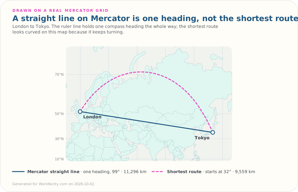
| Route | Mercator heading | Shortest route starts at | Mercator line | Shortest route |
|---|---|---|---|---|
| Paris → Berlin | 62° | 58° | 878 km | 877 km |
| London → New York | 258° | 288° | 5,794 km | 5,570 km |
| London → Tokyo | 99° | 32° | 11,296 km | 9,559 km |
On a short trip like Paris to Berlin, the two agree to within a kilometre. On long trips, they split. That’s why navigators use both. Bowditch’s American Practical Navigator describes the standard method: pick waypoints along the great circle, then draw rhumb lines between them and steer those. Each leg is a straight line on the Mercator chart, and together they follow the shortest route closely.
How the Mercator projection is actually built
It’s often described as a cylinder wrapped around the globe, but that is only a picture to help you imagine it. Shining a light from the centre of the globe onto a cylinder gives a different map, the central cylindrical projection, whose distortion is so extreme it is never used for real maps. Mercator is defined by a formula, not by a light source:
- X (longitude): longitude maps straight to horizontal position.
- Y (latitude): y = ln(tan(45° + φ/2)), where φ is latitude. This is what makes parallels spread out toward the poles.
- Scale factor: at latitude φ, the map is stretched by sec φ (1 / cos φ), and by the same amount north–south as east–west. Equal stretch in both directions is exactly what keeps angles true. At the equator sec 0° = 1, so scale is true. At 60°, sec 60° = 2: lengths are doubled and areas quadrupled.
- Tissot’s indicatrix: draw equal small circles on the globe and project them. On Mercator they stay circles, which shows conformality, but grow toward the poles, which shows the scale inflation.
PROJ documentation covers both the spherical and the ellipsoidal forms for anyone implementing it in GIS software.
Where Mercator is used today
Marine navigation
Rhumb lines stay straight on Mercator charts, so plotting a constant-heading course is still a ruler-and-protractor job. That’s why most nautical charts use the Mercator projection. For long passages, see the waypoint method above.
Web Mercator (EPSG:3857)
Web Mercator is the standard for online map tiles because it makes the tile maths simple: the world fits a square, tiles line up at every zoom level, and streets keep their shape when you zoom in on a city. To make the world square, it stops at about 85°N and 85°S. Google Maps, OpenStreetMap and most web maps use it. Since August 2018, desktop Google Maps switches to a 3D globe when you zoom far out, so the oversized Greenland shows up mostly on other flat web maps.
Transverse and oblique variants
| Variant | Best for | Why |
|---|---|---|
| Standard Mercator | Marine charts, web maps | Rhumb lines straight; accurate near the equator |
| Transverse Mercator | Narrow north–south regions, national grids (e.g., UTM) | Cylinder rotated 90°; minimal distortion along a central meridian |
| Oblique Mercator | Long diagonal regions (e.g., Alaska panhandle) | Cylinder tilted to match the region’s axis |
What Mercator gets wrong
Mercator was never meant for comparing country sizes, but it became the default classroom and web map anyway. Greenland ends up drawn about the size of Africa, though Africa is about 14 times bigger. The Democratic Republic of the Congo, at about 2.3 million km², is larger than Greenland at about 2.2 million km², but on Mercator it looks far smaller.
On 4 September 2026 the UN General Assembly adopted the Correct the Map resolution, which encourages equal-area maps such as Equal Earth where relative size matters, while acknowledging Mercator’s usefulness for navigation. It’s guidance, not a ban. For the projections that replace it, and Greenland and Africa measured on both, see types of map projections explained.
The practical rule: use Mercator for headings and local shape, not for comparing country size.
Measured: the arrow in WorldleCity’s games is a Mercator heading
After each wrong guess in WorldleCity’s daily city game, an arrow points from your guess toward the answer. GeoAngles runs its arrows the other way: from the hidden city out toward each known city. Both use the same code, which calculates the angle on a flat map with longitude scaled for latitude, and that works out to the Mercator heading in either direction, since a rhumb line reversed is the same line. The comparison with the shortest route below is measured in the daily game’s direction, across 166,980 guess-and-answer city pairs from the game’s library:
| Distance | Arrow vs Mercator heading (median) | Arrow vs shortest route (median) | Arrow shows a different direction from the shortest route |
|---|---|---|---|
| Under 500 km | 0° | 0.6° | 2% |
| 500–2,000 km | 0° | 2.6° | 7% |
| 2,000–5,000 km | 0.1° | 6.8° | 17% |
| 5,000–10,000 km | 0.2° | 20.1° | 49% |
| Over 10,000 km | 0.2° | 36.1° | 69% |
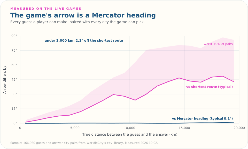
Up close, where the game is decided, the arrow points the true way. Far away, it points the way a sailor holding one heading would go, not the way a plane flies. Guess Bangkok when the answer is Miami and the arrow says east (86°); the shortest route leaves Bangkok heading almost due north (1°), over the Arctic.
Try it yourself
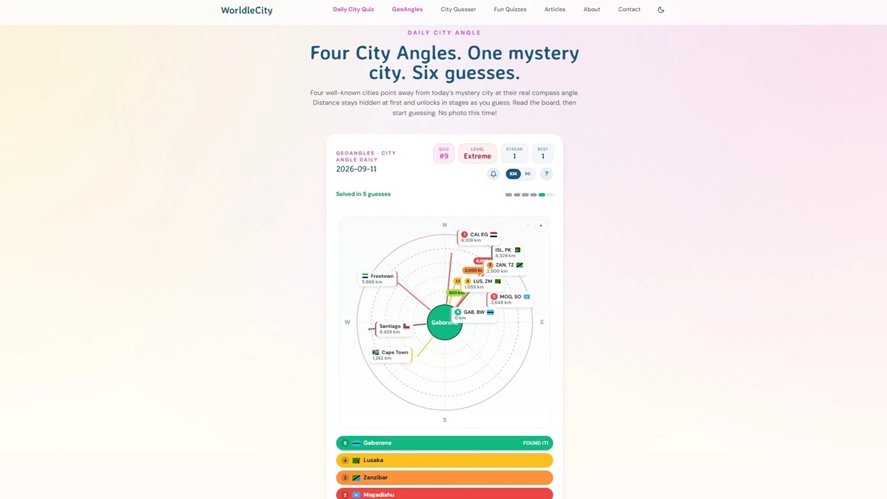
Want to test your own sense of direction? In GeoAngles, four well-known cities point away from a hidden mystery city at their real compass angles, and you read the board before you guess. Distance stays hidden at first. The daily city game gives you a city photo instead, with an arrow after each wrong guess that points the other way, from your guess toward the answer. Trust that arrow up close; on a wild first guess, remember it’s a sailor’s heading, not a pilot’s. To get better at reading those angles, start with how to triangulate a city from compass bearings.
Sources
- Mercator projection (Britannica)
- Mercator 1569 world map (Wikipedia)
- Mercator’s projection: the mathematics (UBC)
- Nautical Cartography (NOAA Office of Coast Survey)
- The Sailings, The American Practical Navigator (Bowditch), ch. 12
- Mercator (ArcGIS Pro documentation)
- Cylindrical projections (Hunter College, CUNY)
- Mercator projection (PROJ)
- EPSG:3857, WGS 84 / Pseudo-Mercator (EPSG.io)
- Selecting a map projection (National Geographic Education)
- Population, surface area and density (UN Statistical Yearbook)
- Correct the Map resolution (UN News)
FAQ
What is the Mercator projection in simple terms?
It’s a flat world map built for navigation: any straight line drawn on it is a constant compass heading. The price is area. Land near the poles is drawn far larger than it really is.
Is a straight line on a Mercator map the shortest route?
No. The straight line is a rhumb line, which holds one compass heading. The shortest route is a great circle, which keeps changing heading. From London to Tokyo the straight line is about 11,300 km and the shortest route about 9,560 km, so the straight line is roughly 18% longer. On short trips the two almost coincide.
How does the Mercator projection distort the Earth?
It stretches everything away from the equator by the secant of the latitude, equally in both directions. At 60° that is twice the linear scale and four times the area, so high-latitude land such as Greenland, Canada and Russia looks far bigger than it is.
Is the Mercator projection still used today?
Yes. Most nautical charts use it, and Web Mercator (EPSG:3857) is the standard projection for online map tiles, including Google Maps and OpenStreetMap. In September 2026 the UN General Assembly encouraged equal-area maps where relative size matters, but it did not ban Mercator and acknowledged its value for navigation.
Why do sailors prefer the Mercator projection?
Because a course drawn with a ruler can be read straight off the chart as a compass heading, and holding that heading takes the ship along the line. On long voyages navigators pick waypoints along the shortest route and sail Mercator straight lines between them.